


For my goal this week, in which I’m trying to get my event planning website up this weekend, I told you that I would create three logos and post them here for you to give me feedback on. Well, I did it.
Here are the three that I was able to create in the time that I allocated for myself. They aren’t the best logos in the world, but that’s because I’m not a very experienced/talented designer. And I can hire a professional to create a better one for me once I get some money to do so {or just educate myself more in Illustrator…}.
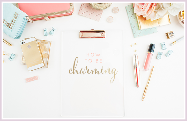
Until then, here is what I came up with:


I wrote the “charming” in that first one, FYI…
And so now, I want to know what you think. If you were hiring someone to help you design and plan your wedding/party, which would have a lasting impact?
And do you have any suggestions on how I can make them better? I am open to anything!
Thank you so much you beautiful ladies! I appreciate this more than you know!
xoxo,
Joelle
23 comments:
Number 2 is my favorite!
First of all, I love that you are an event planner because that's what my background is in! :)
I love all of these - each design is clean and fresh. I think the first and third designs are a bit more memorable. Number one because of the adorable and fun font and number three because of the circular graphic. I do like how number two says "event planning & design" though but it doesn't stand out as much from a graphic standpoint, in my opinion. Again, awesome job with each of these :) I'm so excited for you, Joelle!
third!
Good for you Joelle! You've got this! I actually love the first one. It's so cute and I love the script!
I love the first one; your calligraphy is beautiful. And the third one is gorgeous too!
Number two. It's clean and says exactly what you do.
hm... love all! But I like the first one most, it definitely caught my eye! Maybe this is a silly question but did you create the word "charming" in illustrator?
i like the first one :)
I really like the first one because I love calligraphy. But, I like how the second one says what you do. Maybe incorporate those two?
Yay for getting your website going! I still look up to you for being an event planner ;) I really like the last one with the little curves and stuff, but the first one is great too!
The first one without hesitation - catch the eyes and I like the design of it.
You might want to include something that says what you are doing.
Maybe mixing the 1st and 2nd one (the design of the 1st + description of activity of the 2nd)
All the best with the next days goals!
Definitely the first one but I like how you have "event planning and design" on the second one. The third one is nice but the "A" definitely gets lost in the shuffle, at first I only thought it said "charming occasion" until I stared at it longer, but then I thought there was too much white space on the third one. ok well there's my thoughts, #1 is my front runner :)
These look great! Numbers 1 and 3 are my favorites!
I like the second one the best; the 'a' on numbers 1 & 3 kind of get lost to me...
I like the font the best on the first one - I just think the "a" is a little awkwardly placed and that it should also say event planning and design like the second one.
But they're all pretty awesome :)
xoxo
Jenna
i like the first one the best! the 'charming' font IS charming. i would just move the "a" in front of charming and consider making the whole thing one color (it'll be easier for you to be flexible with future layouts when you dont have to consider two colors in a logo). GREAT job joelle!!! xo
Voting for #1 :) I love your handwriting. i'm jealous lol
I like the first one and third one. my only idea would be that they need more color. my boyfriend Travis Sidebotham from CLU as well does graphic design for his job. I am sure he could help you out (charge free i think..) with a logo if you'd like.
I vote for the first one. It's so cute with the dotted 'i'! Good job!
Number one is my favorite, hands down. And, I think your designs are just as good as many professionals I see...
the first one is my favorite!
I love them all! But I think it's unique and personal that the first one is in your handwriting. The first is my favorite.
First one all the way. I personall y love the two different colors. And since your handwriting is something to be proud of and adds a personal touch, I think it represents your future business...best of luck choosing!
Post a Comment